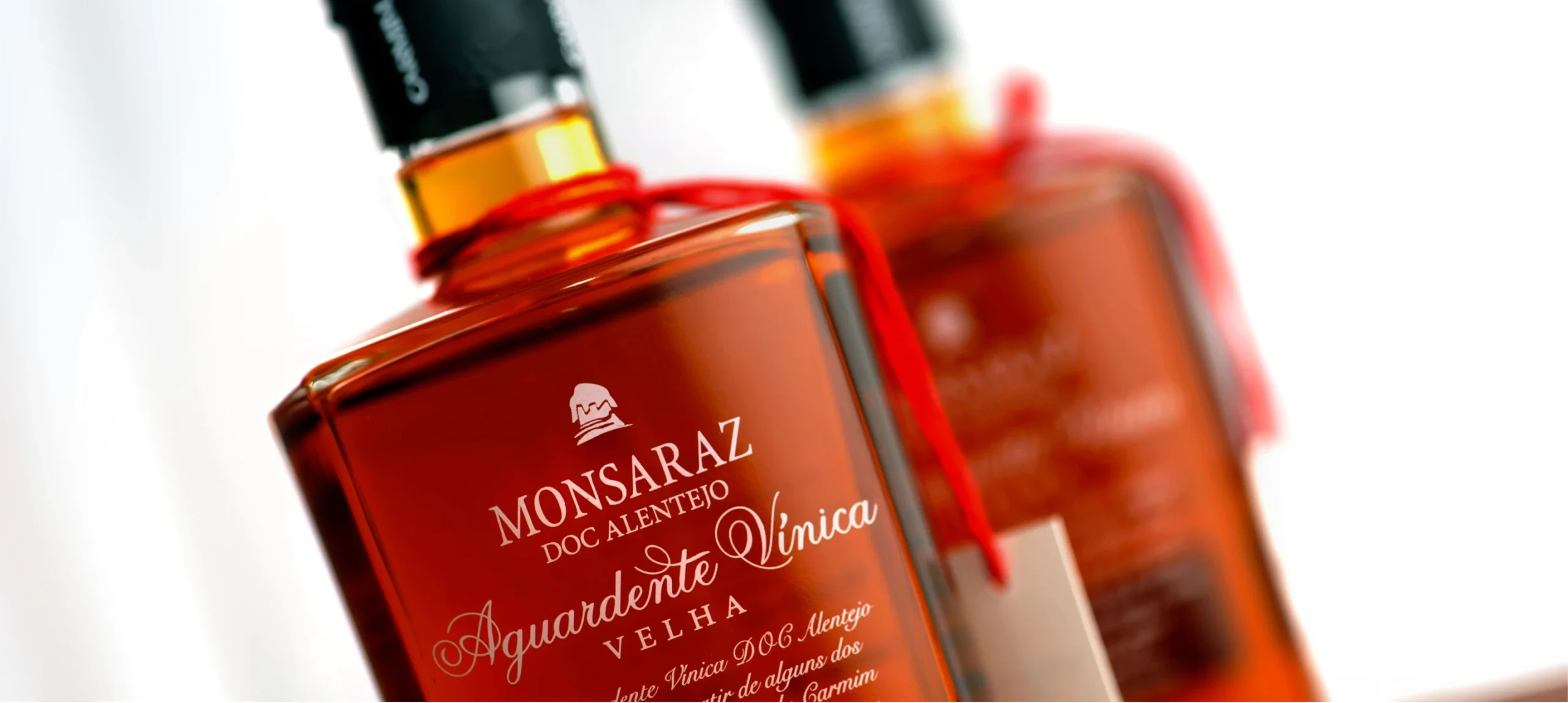
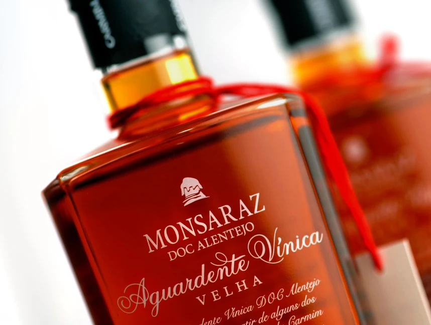
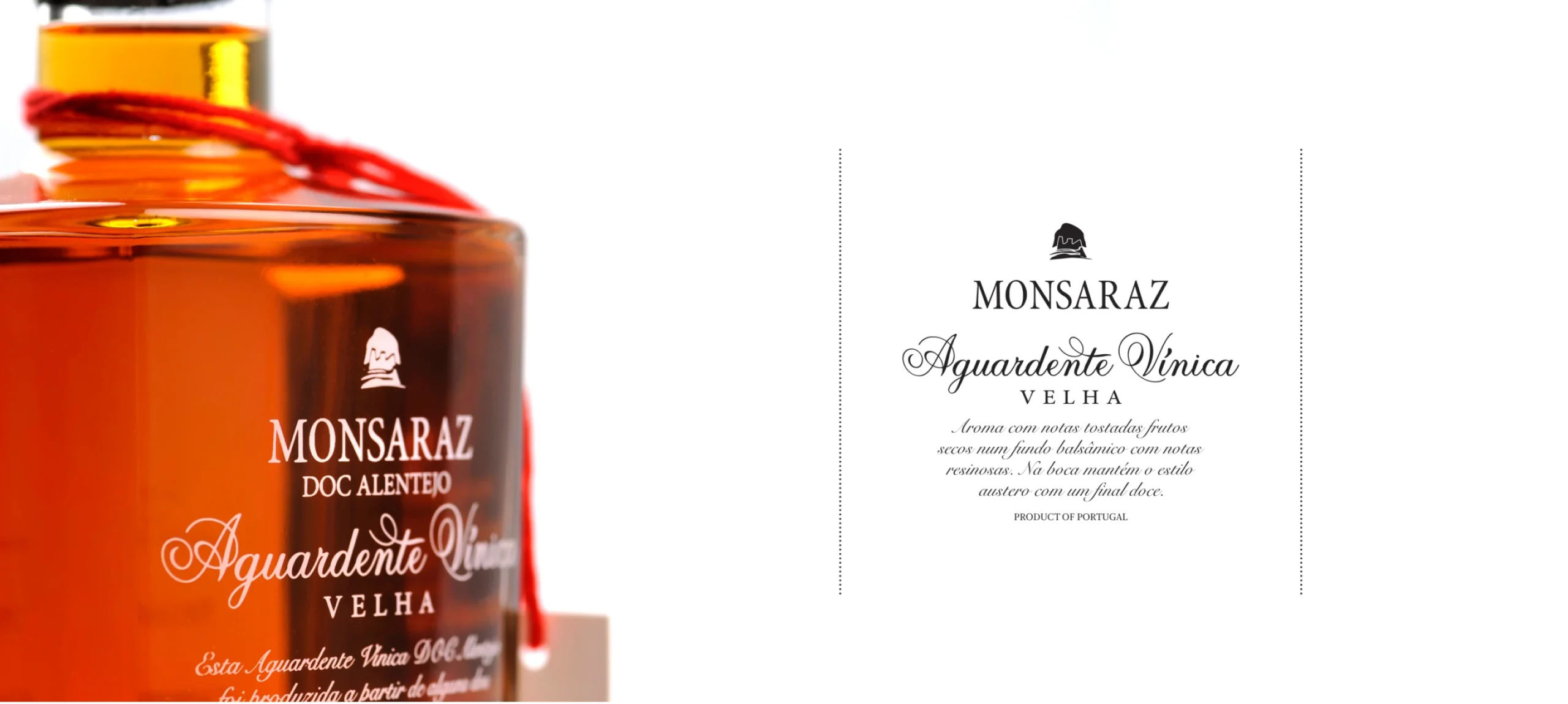
Aguardente Vínica Velha — Monsaraz DOC Alentejo was created to expand the brand into a new territory: more selective, more ritualistic, and shaped by highly established category codes. A universe where tradition carries significant weight, but where that same tradition does not always help brands stand out.
Within this type of category, the risk is familiar: falling into a visual language that feels overly predictable, excessively classical, or unnecessarily solemn where everything appears legitimate, yet very little feels distinctive. The challenge was not to look old in order to communicate value. It was to create a presence capable of expressing authenticity, sophistication, and confidence with clarity and restraint.
The project required building an identity coherent with the Monsaraz universe, while still distinctive enough to establish its own position within a highly codified market dominated by traditional references and formal rigidity.
More than designing a label, the challenge was to define a visual expression capable of reinforcing perceived value, elegance, and singularity without falling into decorative excess or the predictable language of the segment.
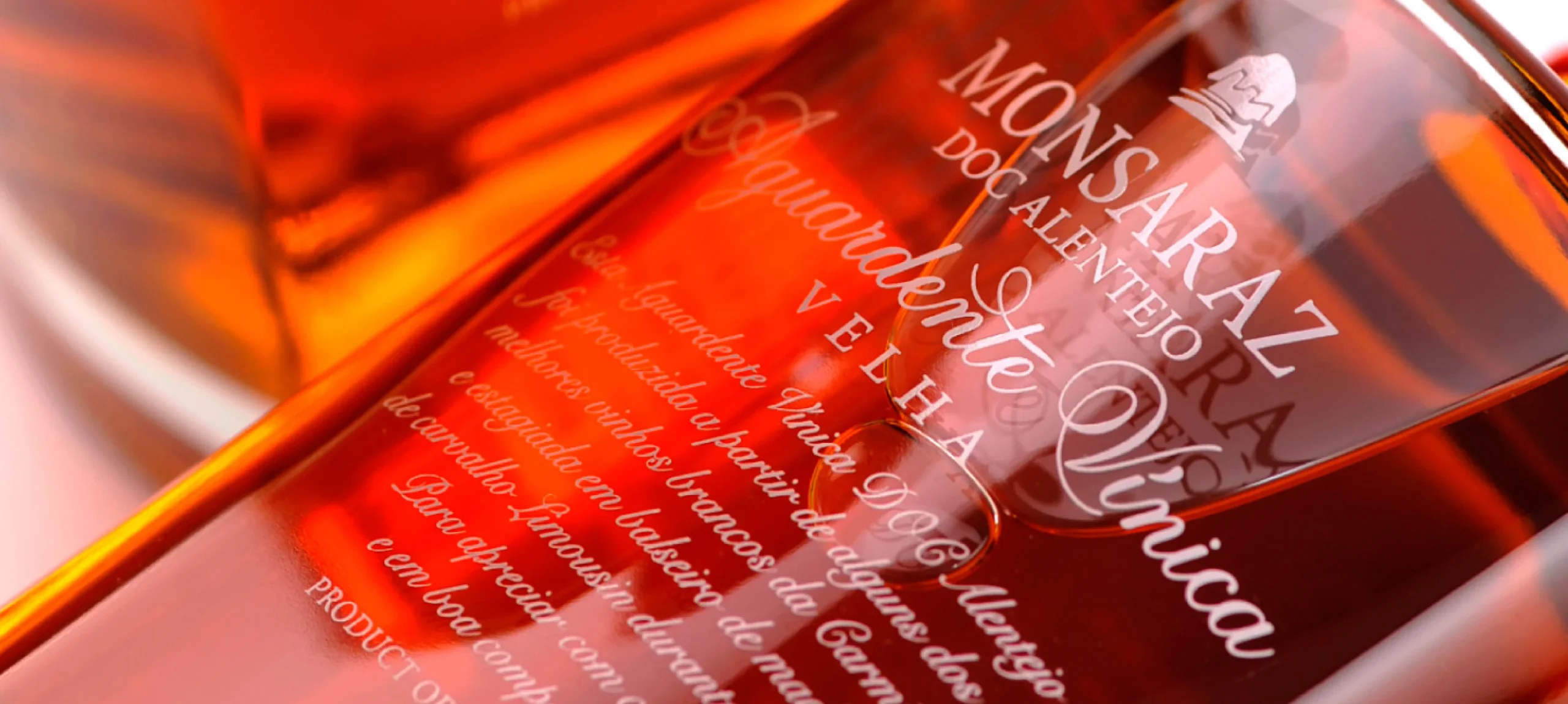
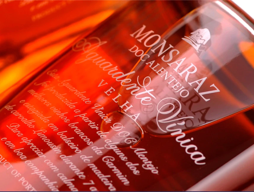
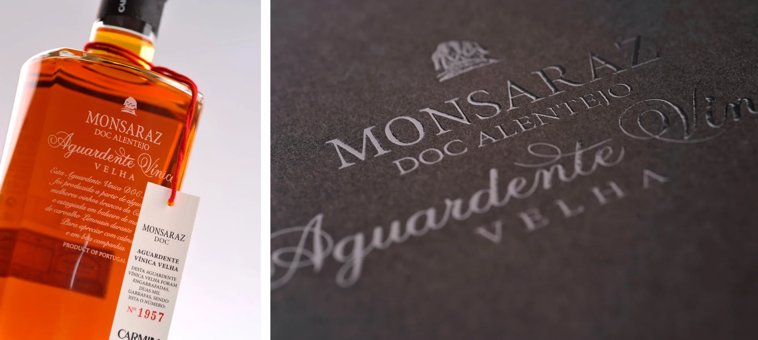
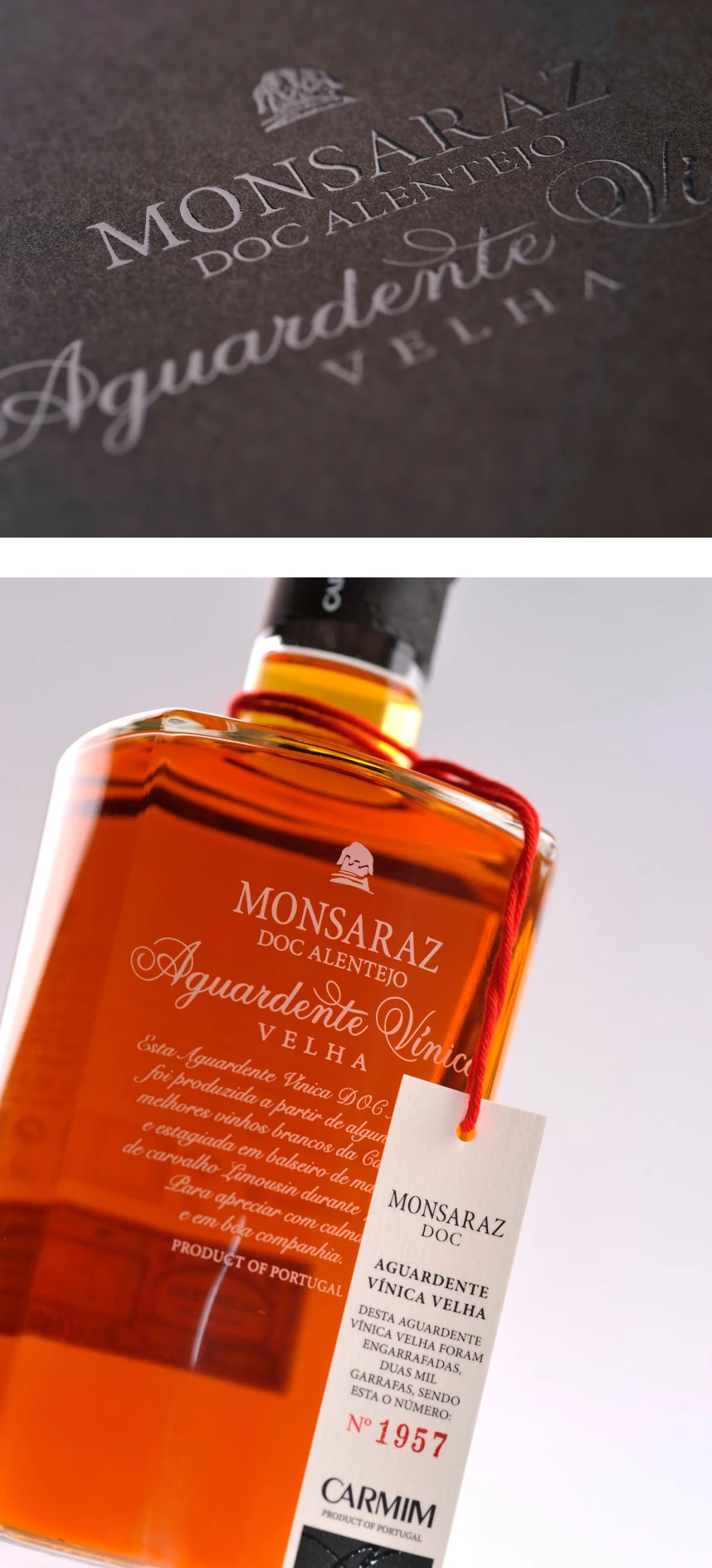
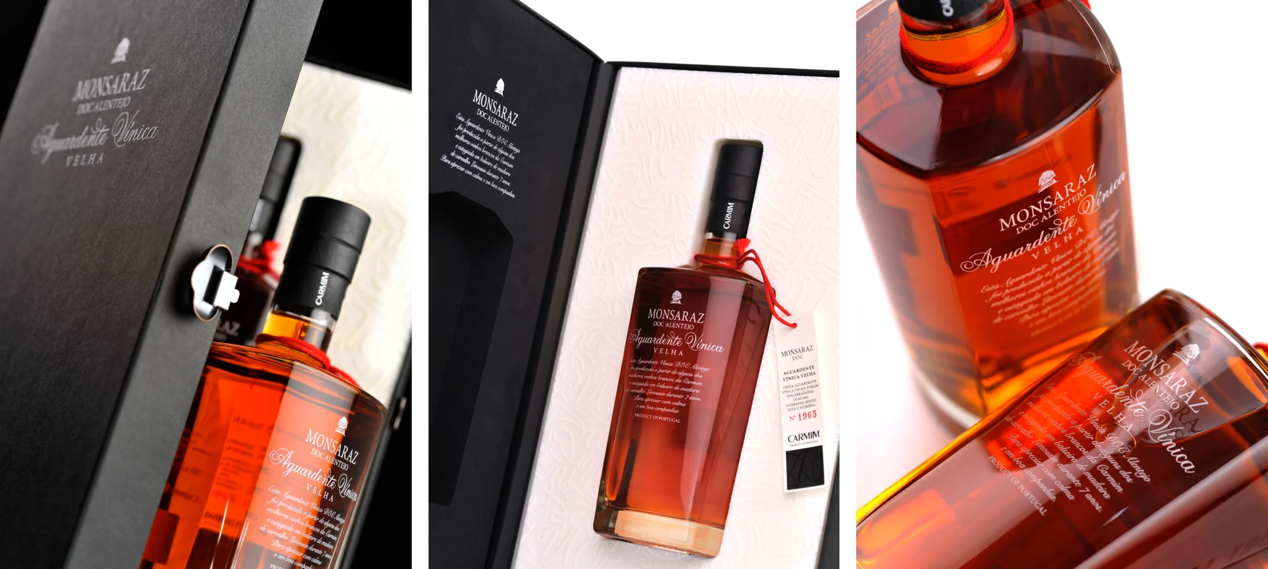
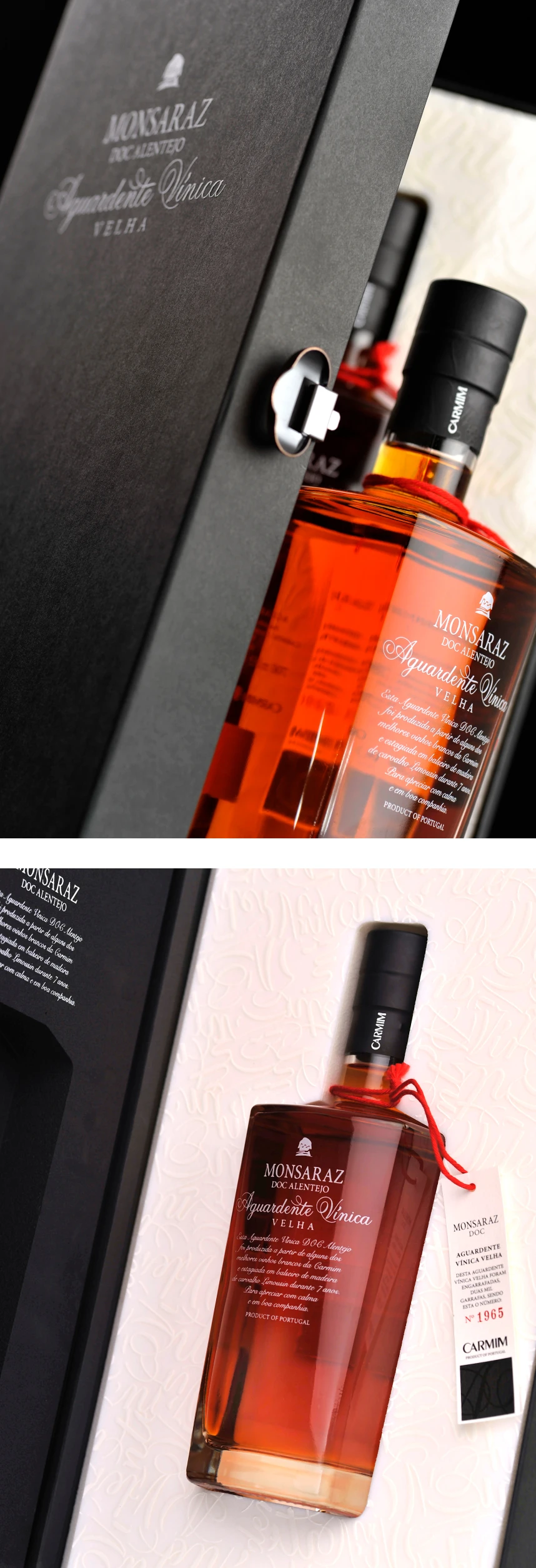
The chosen bottle immediately helped break away from the more conventional foundations of the category, introducing a more elegant, differentiated, and contemporary silhouette. From there, the work focused on creating a more restrained and precise visual language, where lettering, proportion, rhythm, and negative space play a central role.
Rather than overloading the product with supposedly noble or artificial codes, the approach focused on refinement. Giving greater importance to the name, the composition, and the overall presence of the packaging. Less ornament. More intention.
The result is a more distinctive and understated packaging system, capable of positioning Aguardente Vínica Velha — Monsaraz DOC Alentejo within the Monsaraz universe without allowing it to disappear within the category itself.
Rather than simply following the codes of the segment, the project sought to filter and reinterpret them. And it is precisely there that the product gains its presence: through a cleaner, more controlled, and more appropriate expression for a spirit that aims to be taken seriously.
Packaging Design project for Aguardente Vínica Velha — Monsaraz DOC Alentejo, developed for CARMIM.
We use cookies to analyse how the website is used (Google Analytics) and improve your experience. You can accept all cookies or manage your preferences. No unnecessary cookies by default.