AG7Systems is a global fintech offering fully automated copy trading solutions in the FOREX market. It targets individual investors, high-income profiles and long-term thinkers seeking strategies backed by real performance.
The project came to Shift as a blank slate. The challenge was to build a brand from the ground up — identity, positioning, tone of voice and visual presence — all working together to convey trust and transparency in a sector historically known for its complexity.
Our answer was a brand that is clean, strategic and confident. With a clear tone, a professional image, and no reliance on tech jargon. A brand built to inspire trust and support solid growth.
Despite the strong technical know-how of its founding team, AG7Systems had no brand presence at all. Its proposition, based on robust algorithms, audited metrics and full automation, demanded a clear and confident positioning from day one: transparency, reliability and precision.
In a competitive market dominated by outdated visuals and exaggerated promises, the brand’s first mission was to convey credibility and deliver a sense of stability from the very first contact.
Shift was challenged to create a brand from scratch, with both a visual and verbal identity that could reflect the professionalism and ambition behind the project. It was essential to design a coherent universe — built on trust, clarity and strategic consistency — that would speak directly to informed, demanding investors who value substance over hype.
AG7Systems needed a strong, distinctive, modern image, with a transparent message and a polished presence. More than a logo or a look, this was about building a long-term foundation for a business ready to grow with consistency and vision.
Our work began with the strategic brand foundation — defining its purpose, mission, vision and positioning. The verbal identity was designed to be direct, clear and straightforward. No buzzwords, no fluff. Just relevant information, delivered with confidence and professionalism.
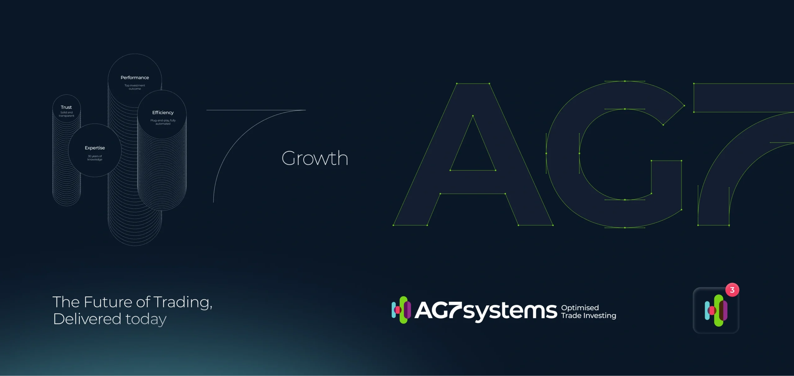
Visually, the brand embraces minimalism and precision, incorporating the iconography of "candles" — natural references to trading markets and financial performance environments.
The color palette adds energy and flexibility to the communication, resulting in a brand that reflects exactly what it promises: automated, dynamic, transparent investment with real impact.